TL;DR; You can start using NGX Skeleton Loader module in your Angular apps right now and get the built-in performance, accessibility, and extensibility benefits. Support the project by starring the Github repository and enjoy! 🎉
** Feel free to play with the online demos powered by Stackblitz https://stackblitz.com/edit/ngx-skeleton-loader-sample
Introduction
Have you ever accessed some old pages and what you saw was a spinner for such a long time that you could never know if the page was loading or if there was an error on the page-loading step? Or even sometimes it shows all the content coming from anywhere, it just popped up in your eyes after long seconds?

Skeleton screens show users that content is loading, offering a vague preview of how content will look once it fully loads.
Using Skeletons to improve Perceived Performance and User Experience
Progressive Web Apps — PWAs are using skeleton screens to make it feel like the content is loading immediately even when it isn’t. This improves perceived performance, make sure the users are aware that the page content is loading and there's something in progress.
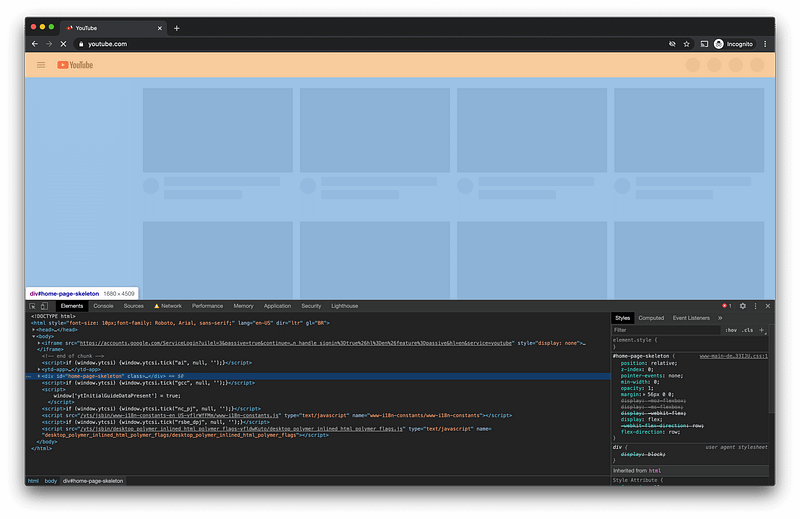
Some apps, such as Youtube, can also use this approach as a whole page load. So it has the first view for the page as a single skeleton describing what to expect on that page as a layout.

Animations aligned to the crucial importance for users
A skeleton screen is essentially a wireframe of the page, with placeholder boxes for text, images, videos, or any other relevant content for the page itself. The main idea is to mimic the page’s layout by showing its elements in a shape similar to the actual content when loaded.
Animations are crucial for the perceived performance purposes since it shows for the user the content is loading by using animations as feedback for whoever is accessing the page.
Changing the themes using CSS or Angular attributes
More than beautiful and pleasant, animations are one of the main foundations of skeletons on the page, having consistent animations. And more than this, In this topic, the main point is consistency: not only on the animations but as a whole experience across your app.

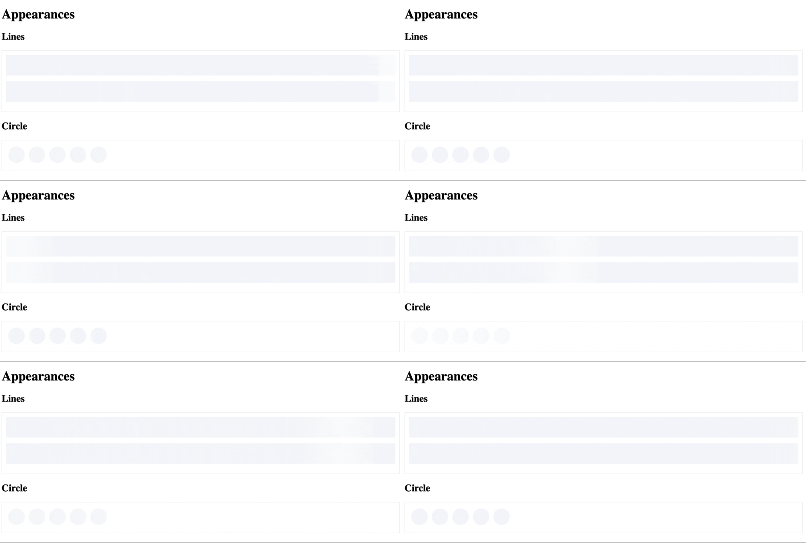
NGX Skeleton Loader module already has some of the most common animation themes and appearances already available, which makes also the developer experience as pleasant as possible by using component attributes as configuration.

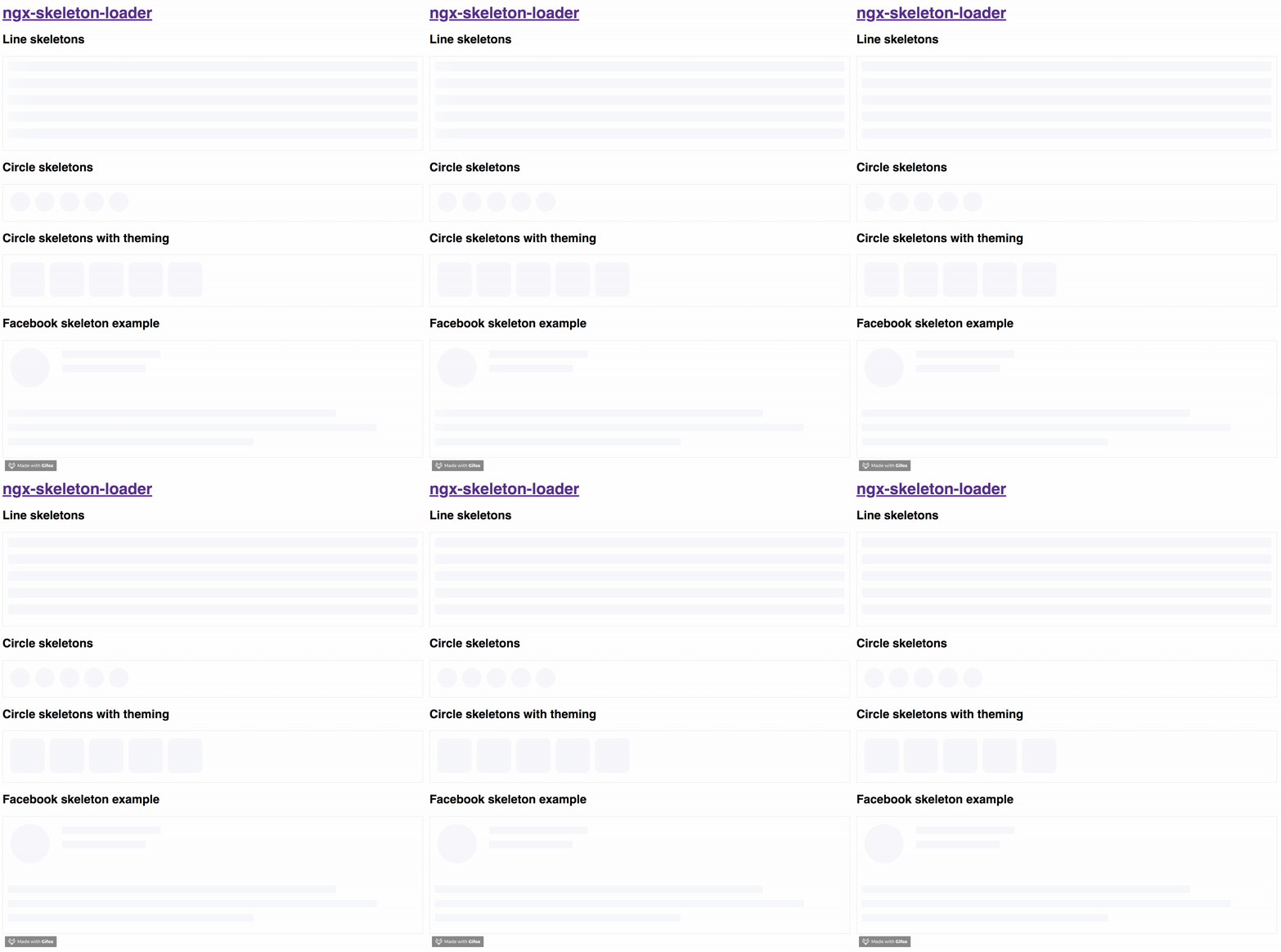
Besides that, the module supports theming the skeleton passing [theme] information as an attribute who receives an object with CSS values. Another approach is to change the styles on the host element where the component is added.
Feel free to play with the online demos powered by Stackblitz and check how it works!
Combining states and accessibility
Accessible Rich Internet Applications Suite — WAI-ARIA — defines a way to make Web accessible to people with any type of disabilities by defining technical approaches for the pages to inform specificities about the content to the browser. Attributes such as tabindex, role, and aria-busy are extremely important for assistive technologies such as screen readers. So that, users with any type of visual disabilities can understand that the specific state of the fragment of your page is currently loading, as an example.

Different than other packages, NGX Skeleton Loader module covers this aspect as well by adding aria attributes on the skeleton content which informs the browser that the specific fragment of the page is not accessible at the moment since that block on the page is busy loading the final content to be displayed.
By using that approach consumers/customers will have improvements in their experience when accessing their pages. You don't need to apply any effort for that, it's already available when the module is added and running in your web app.
Reduce motion and Web Accessibility: respecting the user’s choice
There are levels and intentions when using dark-mode and independently of the approach, you decided to use to integrate that into your application.
It should be added to focusing on the consumers by respecting the current device who is accessing the page and the system preferences, as empowering your users. Everyone should build user-centric web apps, supporting their decisions on this topic.
Reduce motion is not papercut, this is and always will be about accessibility as well.
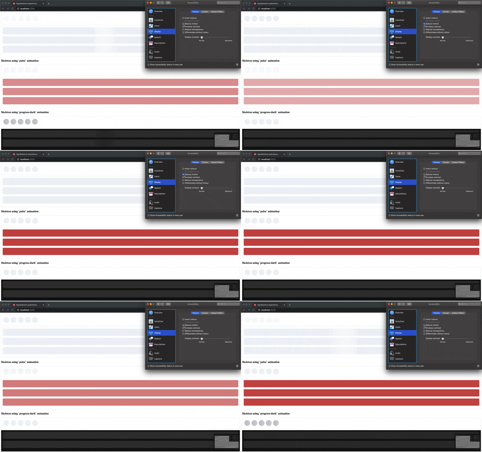
To solve that, the module already has this support as a built-in feature. It means that it will remove the animations if the user reduces the motion on their laptop, mobile, or any other device used to access your product page.
By using the `prefers-reduced-motion` CSS media query you can add this support, respecting the user’s OS option Reduce Motion.
More details about `prefers-reduced-motion` in https://web.dev/prefers-reduced-motion/

Bundle and package size matters
Bundle and package sizes are always important and this is something to keep in mind when thinking about this module.
The module supports multiple animations, themes, supports for better web accessibility and more feature with an impressive bundle size of 1.22KB and the package has 104kB to be installed in an application 🎉
That’s all for now
Stay tuned because this is not the end, it's just the beginning. Let's keep building awesome stuff and have #ngxFun 🚀
I hope you enjoyed this reading as much as I enjoyed writing it. Thank you so much for reading until the end and see you soon!